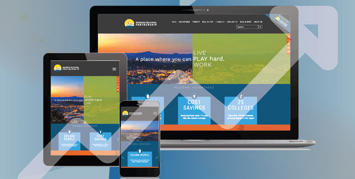
Roanoke.org Visibility Increases After Redesign
The Roanoke Regional Partnership launched a new website design in August and it seems that you like what you see.
A big part of the plan for the redesign was to make the website more user-friendly on desktop and mobile devices. With larger typefaces, bigger imagery and an overall content reorganization, analytics show that the website is meeting its goals.
Among the highlights:
- Overall visit to the website are up 24 percent in the first month after launch and the number of users is up 44 percent.
- Mobile traffic has increased more than 50 percent (because the new design is so easy to use on a phone).
- The bounce rate plummeted 50 percent to 18 percent (this is a measure of how many users leave the website after viewing only one page; a low rate means users are moving from page to page on the website).
- Traffic from organic search, such as Google, is up 15 percent thanks to enhanced content and search optimization.
The website is an important element of the Roanoke Regional Partnership’s overall marketing strategy and serves as a gateway for businesses, site selectors, and residents looking to learn about the region and refocused content showcases natural and business assets. Information is grouped and organized in sections such as data, advantages, targets, and livability to make it easy to find data points or other information quickly.
You can use roanoke.org as a resource as well. Keep up with news on the blog, find key talking points to share with job candidates, and gather market information to help you make business decisions.
